Many business owners select their color scheme based largely on personal preference, but did you know that there is a whole psychology behind color choices? Choosing the right colors for your business logo is essential. Color can be used to invoke certain emotions, creating a whole range of feelings, from calm to energetic. When choosing a color for your business, consider its connotations. For help deciding what works best, here are some examples of from local San Antonio businesses who rocked their color choices:
Purple
Purple is a color of mystery and richness, and is often associated with royalty. It embodies the energy or red with the calmness of blue and it is neither a warm nor cold color…thus the mystery. It is at the same time uplifting and associated with bravery, case in point the Purple Heart. Very few businesses use purple in their logos the most famous being Yahoo and Crown Royal, they really embrace the connection to royalty.
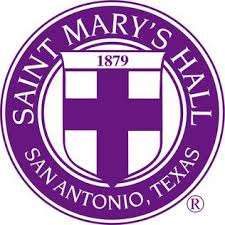
Purple can also convey sophistication and spirituality, which are both embodied in Saint Mary’s Hall, one of San Antonio’s best private schools. Founded back in 1879, this originally Episcopalian school has shed its religious ties, but still promotes academic excellence. St. Mary’s prepares its students for life after high school with a rigorous and challenging curriculum, even offering 26 AP courses. With tuition ranging from $13K for kindergarten to $24K for high schoolers, this school isn’t just for anyone. Families paying those kind of rates for their children’s education expect the royal treatment.
Saint Mary’s Hall
9401 Starcrest Drive
San Antonio, TX 78217
(210) 483-9100
Red
Red is the color of passion and energy and it evokes a visceral response. It triggers the pituitary gland and raises your heart rate, it is attention grabbing and provocative. It is used by brands like Coca Cola and CNN, brands once thought to be cutting edge.
Rocking a red logo on your brand will give your customers the impression that your brand is strong and established. That it’s something they can trust. Logos in crimson have been proven to work best for restaurants and retail stores since it increases appetite and encourages individuals to buy impulsively.
Blue
Reminiscent of the sky and the ocean, blue is said to put you at ease. It is arguably one of the most common colors used in logos and branding. It conveys sincerity, family, wholesomeness, responsibility and general good feelings. Blue works well for the corporate world and you will find it used most often by conservative business, attorneys, accountants and insurance companies. Famous businesses branded with the color blue are Dell, Facebook, Walmart and American Express just to name a few.
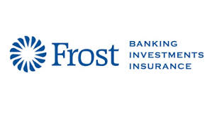
In San Antonio, the blue Frost Bank logo is synonymous with stability and dependability. Around since 1868, this San Antonio based company has been taking care of Texans’ banking, investment and insurance needs for more than 150 years. Today, Frost Bank is the largest Texas-based bank, with 126 locations throughout the Lone Star State. The relatively simple logo is uncomplicated, with just a simple emblem and undecorated font. This bank isn’t about being fussy with their design; they are all about the business of banking, which is what we would hope a major financial institution would prioritize.
Frost Bank
100 West Houston Street
San Antonio, 78205
(800) 513-7678
Green
Green is often associated with calm, freshness, nature, health and healing. Like blue it is extremely common as a branding color, invoking emotions like compassion and empathy. Some big businesses that use green are Whole Foods, John Deere, and Tropicana, all of these are associated with food and farming. Health industries will use green a great deal too.
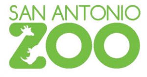
Right now, the San Antonio Zoo (Twitter) is rocking the green look with its playful logo that incorporates the silhouettes of some of its most popular residents, the giraffe and rhinoceros. This logo welcomes visitors to take a peek at some of the most intriguing animals found in nature, while suggesting health and well-being.
San Antonio Zoo
3903 N. St. Mary’s Street
San Antonio, TX 78212-3199
(210) 734-7184
Yellow
Yellow is most associated with the sun so it invokes feelings of optimism and hope. It is warm and happy while stimulating the logical side of the brain. However, too much yellow can cause anxiety and nervousness, so for business in makes a better accent color. That hasn’t stopped plenty of big brand names from using yellow to stand out, McDonald’s and Subway both use it.
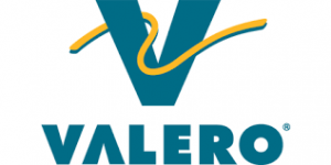
San Antonio energy magnate, Valero, makes great use of yellow as an accent color splashing across its otherwise teal logo. Not only does this dash of color catch the customer’s eye, but it suggests energy, which is perfect statement for a gas company. Zip in and fuel up on Valero gasoline, and hit the road with renewed optimism and oomph.
Valero Energy Corporation
One Valero Way
San Antonio, Texas 78249
(210) 345-2000
Orange
You take the cheery yellow and combine in with the boldness of a red and you have the cheerful confidence of orange. It is a warm and vibrant yet bold and playful color, and you will find orange splashed across some well-known logos. Hooters, Amazon, Payless and Harley Davidson all use the richness of orange to stand out in the crowd.
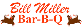
There are few things that Texans love more than BBQ. Major BBQ outfit, Bill Miller BBQ (facebook), has been serving up some of the best brisket and ribs in San Antonio since 1953. Their iconic orange and brown logo featuring a cartoonish cow, chicken, and pig, beckons drivers to pull over for a decades-old tradition of delicious food. Though it appears that the logo hasn’t changed since the 1950s, neither has the company’s commitment to smoking fantastic BBQ. We think they should keep things just the way they are!
Bill Miller Bar-B-Q
P.O. Box 839925
San Antonio, Texas 78283-3925
(210) 225-4461
Before you go out and redesign your entire logo and marketing materials to make everything blue or red, bear in mind this is very subjective. Color is too dependent on personal preferences and life experiences to ever effectively translate into a universal statement. However, if this article leaves you craving a logo revamp, we’d be happy to help!